
Picking the colours for a presentation’s visual aids it is something that has to be considered and done before sitting down to design them. This is true regardless whether you have a corporate palette (how to create yours?) or not.
The first and foremost reason is readability. How many times it troubled you to read information on the projected screen? Sometimes the font is too small but sometimes there is not enough contrast between background and foreground colours.
The second factor is that colours convey meaning both on logical and emotional level. Red alert, green with envy, blue-rinse, white flag, black dress or a grey day are common expressions and they trigger emotions in the audience. Let’s have a quick view of what are the common associations that our minds tend to do with the different colours.
White is purity, cleanness, and spirituality.
Yellow is the sun and happiness. Commonly, and not surprisingly, smiles sport this colour.
Orange is youthful, warm, summerish and flamboyant.
Pink is a female colour but also show tenderness and is often used in fashion.
Red is blood, fire and passion. The true opposite of quietness with both positive and negative as in dangerous.
Green is the colour of nature and health, and is also the one we can distinguish more nuances.
Blue is a peaceful, calm and trustful colour. For this reason some medical institution they prefer it to green.
Brown is the Earth and also simplicity.
Purple is the royal colour but also conveys mystery.
Grey it is very conservative and evokes classics and formality.
Black is elegant and technical but is also associated with sadness and in many cultures with death and mourning (mind in others it is white!).
Avoid choosing colours that clash with your message but rather go for ones that are aligned with it and possibly convey the emotions you want. A very common example is the red / green. The former can show a stall situation or a block while the latter portrays the free way message as with the traffic lights.
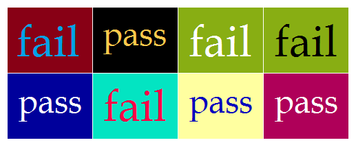
Reading the previous lists you may have noticed how some lines are less readable most notably the yellow one. No matter which colours we picked we cannot forget to check if we have enough contrast between the foreground and the background. On-line there are plenty resources to help you from tables to formulas but often is enough just to keep an eye for it (this table come from the second linked page and is a good example).
Some colour-combo should be always avoided since it is known that they can cause problems with projector and with people with colour disabilities:
- Red and blue do not offer a good contrast even more on a computer (in case you can separate them with some white as in the union flag)
- Red and green do not work well together and some people have issues distinguishing them
- Orange and blue tend to vibrate.
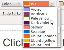
Every colour could be tuned by changing its hue, saturation and so on. Colour theory is a fascinating subject and if you want to know more feel free to dig in. For the time being I just want to point out that you are not forced to use the pre-set colours even though there is a good choice:
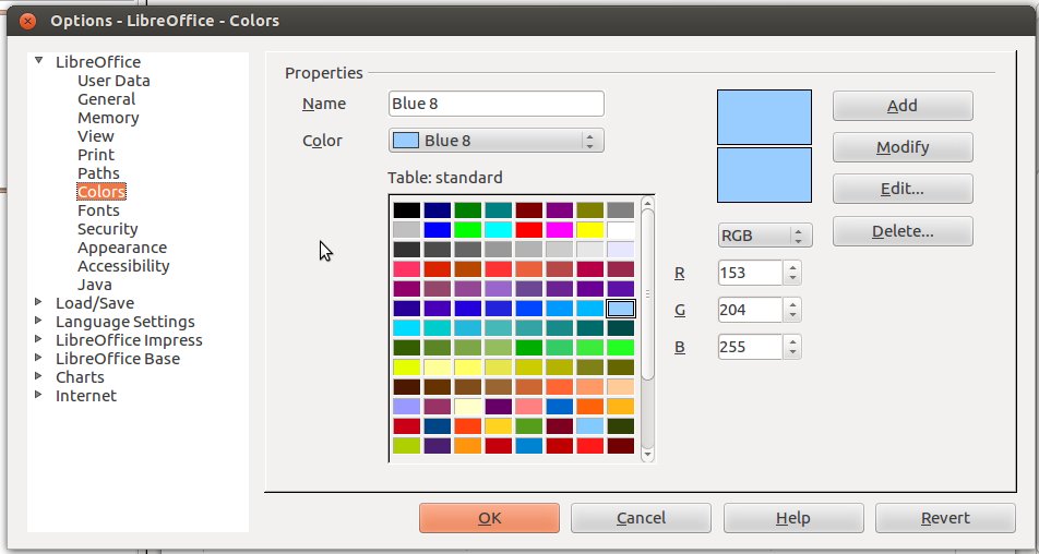
If you would like a slightly different colour (a darker salmon?) you can easily create it your self going to Tools > Options and then Colors:
You can also view the video guide I posted some weeks ago.
Speaking of contrast the starting point is the background colour. White and black are at the opposite of the spectrum and they are an easy choice since they can guarantee you a good contrast as long as you use dark foreground with the former and light ones with the latter. The available images, pictures or charts should also taken into account when picking a background.
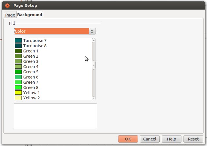
When you are ready you can apply it to the master slide or select it for each slide. Right click on a slide and go for Slide > Page setup…
Once you click ok you will be asked if you want to apply the background to all the slides in the presentation:

I believe the idea is to push for background uniformity which is not a technical issue but rather good design. If you can opt for a single background but avoid lowering readability. It is better to have one or few more background rather than making it difficult for your audience to read what is on the visual aids. For my Successful Presentation slide deck I tend to use full screen photos but I also use white when there is not one and black for the video pages.


- Go for effective colours that are coherent with your message and they resonate with the emotions you want to trigger
- Always check if you have enough contrast to maintain good readability. Try to figure out if anyone has some colour disabilities, anyway see how they look like when projected since very often it differs from the laptop screen
- Do not use too many colours, keep it neat and simple.
- Unity and consistency are good design principles. If all the titles are in red, stick to it.
Recent Comments