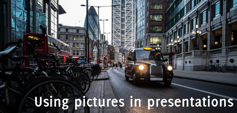
I am a big fan of using pictures for the visual aids of a presentation. They work almost every time, especially when those are high impact photos.
There are some technical tips on how to resize and manage them and I even have a full lecture about it in my eLearning video-course on how to write and deliver great presentations. Today I want to give you two advices that are more conceptual.
The first one is to try to find images that not only support your message but have a strong contrast or are emotionally charged. Avoid blend and dull ones. You want to stimulate your audience, you want them to react, and maybe resonate, to them. Contrast come in different forms and in my workshops I normally show a beautiful example from the artist Banksi that conjugate colours, black and white and a stark contrast in meaning.
The second advice is to keep a stylistic unity. If you go for black and white pictures (a great choice often) stick with them. Mixing different styles seldom works, so avoid using in the same set: photos, landscapes, drawings, abstract pictures, cliparts (their best place is normally the bin), and so on…..
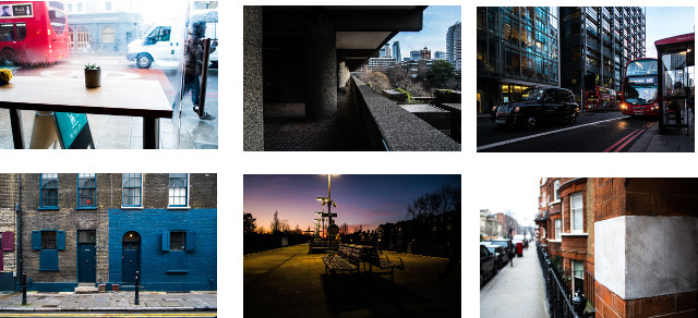
With a little effort you can find sets of images that have a continuity like this example on London I got from Death to Stock

In this given example the fil-rouge is the UK’s capital, but you can achieve unity in different ways, both on content of form (portraits, object close-ups, charcoal drawings, outlines, art photos, … ).
Not only your slides will look more elegant and refined but that’s also effective design. Since you create an element of continuity your audience will focus only on the changing content, which is where you want their attention to go. If I show them ten different products, I want them to take notice of the products themselves, not the style to present them!


Recent Comments