
How you format a number (when you present data, but not only) has a great impact on how it is perceived and evaluated even by professionals.
A very interesting experiment is reported in the great book Thinking Fast and Slow by Daniel Kahneman at page 330.
Professionals evaluated whether it was safe to discharge from the psychiatric hospital a patient, Mr Jones with a history of violence. The information they received included an expert assessment of the risk. The same statistic were described in two ways:
Patients similar to Mr. Jones are estimated to have 10% probability of committing an act of violence against others during the first several months of discharge.
Of every 100 patients similar to Mr. Jones, 10 are estimated to commit an act of violence against others during the first several months of discharge.
The professionals who saw the frequency format were always twice as likely to deny the discharge (41% compare to 21% in the probability format).
Using 10 out of a 100 is a more vivid image that triggers different reaction even in people who are expert and accustomed to make judgements.
This is something you want to keep in mind when you present data and design slides. Let’s get another example quoted on the same page of that book and let’s suppose we are preparing the visual aids. This could be the base slide:
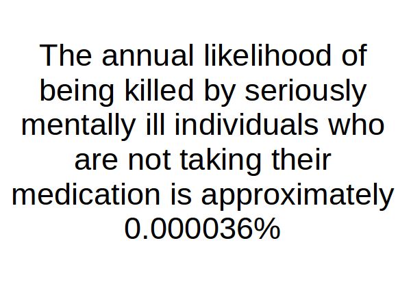
This is a pretty straightforward slide and the the message is literally black on white. Now let’s try to add some visual impact and most of all change the way the data is format. Like this:
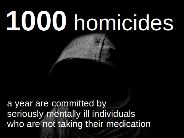
What do you think? It is exactly the same transmitted message, do you believe that also the received message will be the same?
Now what about if we still use an absolute number but we juxtapose a reference?
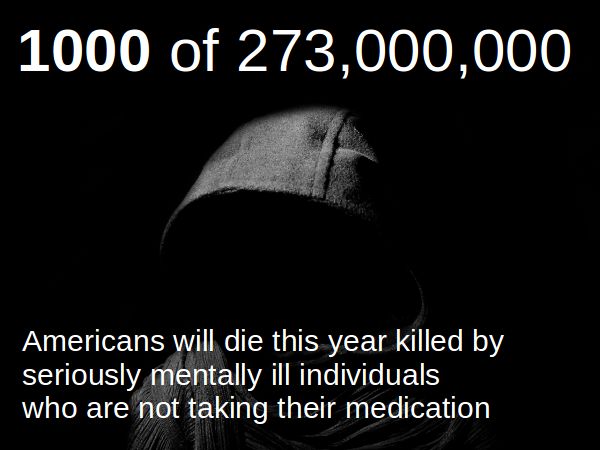
Do you see the difference? To create a context you could also use different kind of deaths:
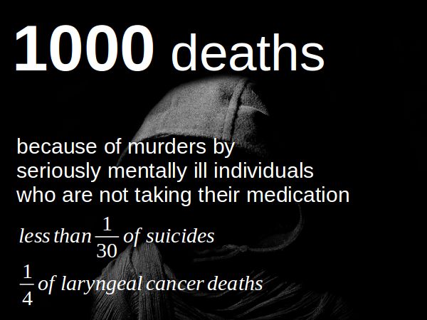
Above you see 4 different slides all generated by the same number. It is quite obvious that their impact on the audience is different and the book of Kahneman will tell you the reason behind.
Of course this could lead to a manipulative use, to over scare people, or under estimate a risk, depending on the interest of the speaker. This is not what I am advocating and you should use this knowledge honestly. What is important is that how you present data has a tremendous impact on how is perceived by the audience. If you don’t consider it properly you risk to dilute your message or avoid getting the results you are expecting.
Recent Comments