
The idea came long ago from this Timothy Samara’s beautiful book:
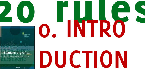
It talks about graphic design and it mentions 20 rules to keep in mind, you may break them, but only after you understood them and you do it for a good reason. Here they are:
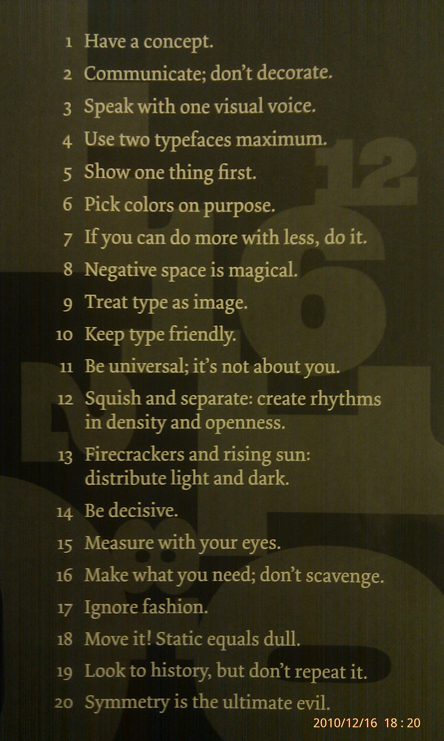
As you can see from the overlay in the bottom right, I shot this picture in 2010 with the idea of doing something. Now, finally, I decided to run a series of posts on how to apply each rule in visual aids for presentations (typically slides). Next post will be on rule number 1 but before that an important disclaimer.
The twenty posts that will follow are based on my personal interpretation of the rules and are not strictly related to Timothy content. Some time the rule could be only a guidance to a related concept. In some other cases it won’t apply merely to slides but public speaking in general. In short I will use the rules as an inspiration.
Recent Comments