
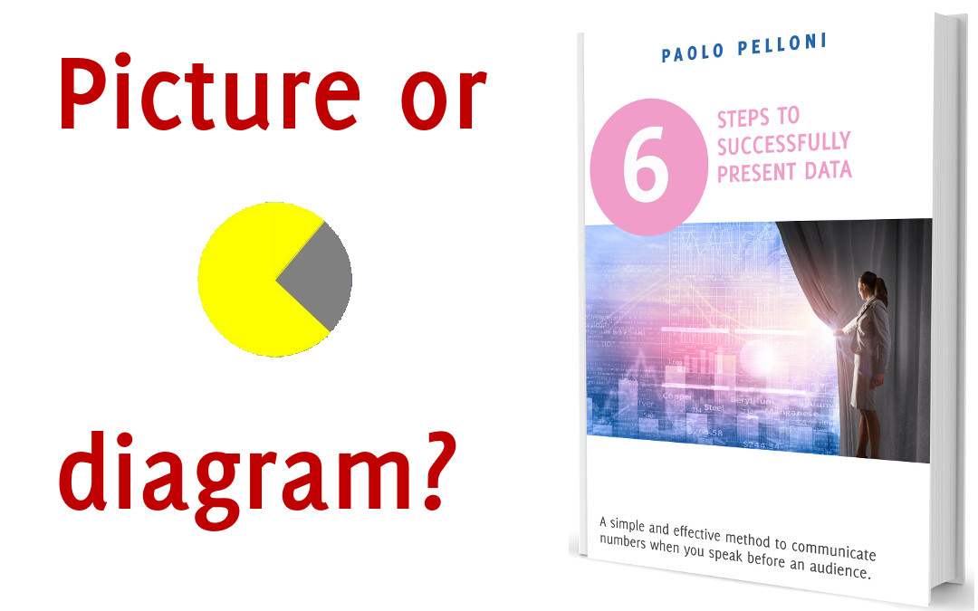
Sometimes I am asked if is it better to use a picture or a chart to represent data (or a series of them).
Charts can be complicated and boring but they are the natural tool we use to visualize numbers.
Pictures are more appealing, have a higher emotional content and give an instant visual idea, but it may not be easy to associate them to numbers.
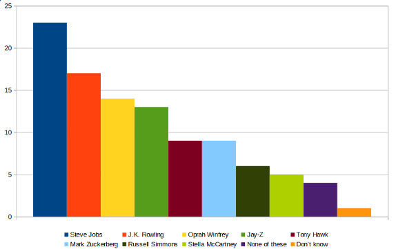
I would like to show you this graph that caught my attention some years ago.

What do you think?
What do you believe is positive and what could be better?
I believe that despite being a bit thick it manages to mix the two elements better than what a normal chart would do.
It is not a technique you can use in every occasion but it’s worth considering when you present data. You may have to choose between picture or chart or you can try to combine them.
If you are not able to achieve a similar effect as in the example above you have other options you can evaluate. You can add a picture next to the chart that visualise the topic or the main idea the chart is trying to convey. Another idea is to have it as a background. The only thing you don’t want to complicate the visual too much. They work only if the chart is simple and contrasts well in the case of the background.
Recent Comments