
For many companies, corporations in particular, it’s quite normal to have their logo on slides they use for presentations. This is something I often discuss in my public speaking courses when we get to visual aids design. The question that arises is: “Is it a good or a bad thing?”
First of all I would rephrase it more correctly: “should the logo appear on ALL the slides?”. Clearly there is nothing wrong with using it when needed, it’s a different thing to have it in each one as a background element.
The answer is not blunt and neither immediate, and we need to first observe that in several cases the logo is part of the corporate template and for many is not option on the table to decide if to keep it or not since they have to follow strict guidelines. Nevertheless tackling the question can give us some useful feedback.
Two thesis
“If you are delivering a presentation and after 20 minutes the audience doesn’t know who you are and what company are you with, you have a big problem. The logo on your slide won’t solve it!” is argued by people against its use on every slide.
“Logo is branding, you want to do it as much as you can and consistently, furthermore if somebody picks a single slide there is a risk of not being able to tell from which company it is” is the thesis of people, generally in communication, that frequently are the ones who set corporate templates.
Who do you agree with? You can comment below adding also your own ideas.
I try to answer as I do in my workshops, bringing up and idea lifted from physics.
Signal vs. Noise
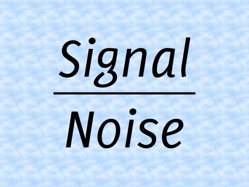
Enter signal vs. noise. What does it mean? The signal-to-noise ratio definition according to Wikipedia is.
Signal-to-noise ratio (abbreviated SNR or S/N) is a measure used in science and engineering that compares the level of a desired signal to the level of background noise. SNR is defined as the ratio of signal power to the noise power, often expressed in decibels. A ratio higher than 1:1 (greater than 0 dB) indicates more signal than noise.
For example, when you listen to the radio you want to hear your music (signal) over the background noise (noise, exactly). You can always amplify the signal to cover the noises, but up to a certain point, then distortion kicks in. So when you reach a plateau the only thing you can do is minimise the noise. It’s pure mathematics, to maximise the fraction you can make the numerator (above) bigger and/or lower the denominator (below). You want the communication to be at its best, with the highest possible SNR.
Going back to our slides the point you want to make on that specific visual aids (i.e. sales are up 20%) is the signal. What is the noise? Everything else that is distracting from the signal. Any fancy unrelated backgrounds, extra elements that don’t add value to the point of that slide are noise. Also the logo on each slide. I am not going to judge how bad it is, but surely it is noise, in the given example the logo doesn’t help make the point of the increase in sales.
What others do?
In my experience most of the corporations do have the logo on each slide, while small business and have more a mixed situation.
Since branding is involved in the idea of putting the logo, let’s try to see what the top brands (according to Interbrand) do.
Apple has a very clean template with no logotype (the writing Apple) or logomark (the bitten apple). They use their own fonts and a recognisable background to achieve branding.

I am not as familiar with Google slides decks as I am with Apple but from a look around it seems they are not using their logo either.

Amazon is famous for banning PowerPoint internally but there are keynotes delivered outside. I tried to look both at Amazon (retail) and AWS (cloud services) and I see the logo on the slides (sometimes top left, sometimes top right). They even have a page number bottom right here (that’s a noise for me).

Microsoft is unclear to me, some slide decks they have the logo and others have not (the majority of what I found).
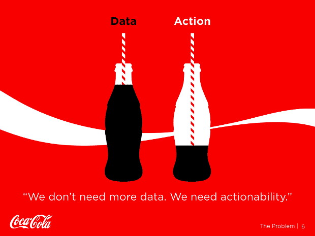
For the next two I decided to pick two brands that are not digital or IT: Coca Cola and Toyota. Both they appear to have their logos on slides.

As you can see there is not a unique approach to it.
Conclusions
Having the logo on all the slides is not a positive thing from the presentation perspective, albeit it may be a branding thing. It increase the noise on the visual aids without adding any value. I am not saying you definitely should not have it, it’s your choice (or corporate policy) but it is worth thinking about it, and decide based on what you think is right (rather than what most of the others do).
Have I my logo on all my slides? No I haven’t.
Recent Comments