
What is better to use: images or illustrations? Or icons?
Please note that by images I mean photographs. So, for example, if you want to convey a flower, which of the following representations is more suitable for a slide?

The simplest and most immediate answer is the first one, when you want realism and credibility, the second one for personalization and imagination and the third one to represent a meaning.
Let’s drill down
Photographs are inherently more realistic than an illustration or an icon. For this reason they are always preferable if you want the public to associate it with reality. For example, if I talk about a product, nothing is better than a photo of the product itself (where that is possible).
Do you think our brain processes images or illustrations faster? The former!
Do you always have to use photographs?
Not necessarily, in some special cases the illustrations can be better. For example when you cannot find what you want to represent (it doesn’t exist or there is no picture available). Do you want to show a yellow Ferrari with purple polka dots? Perhaps it exists, who knows, but an illustration can certainly create it. Graphic creations also allow you to add a personal style to a visual representation, or to emphasize some features. Returning to the example of the product, illustrations could be the right choice to exaggerate one of its peculiarities.
Finally, icons are a good vehicle to represent a concept in the broadest sense. Toilets doors usually sport an icon, the need is simply to indicate which one is male and which is female. No realism or graphic style is needed.
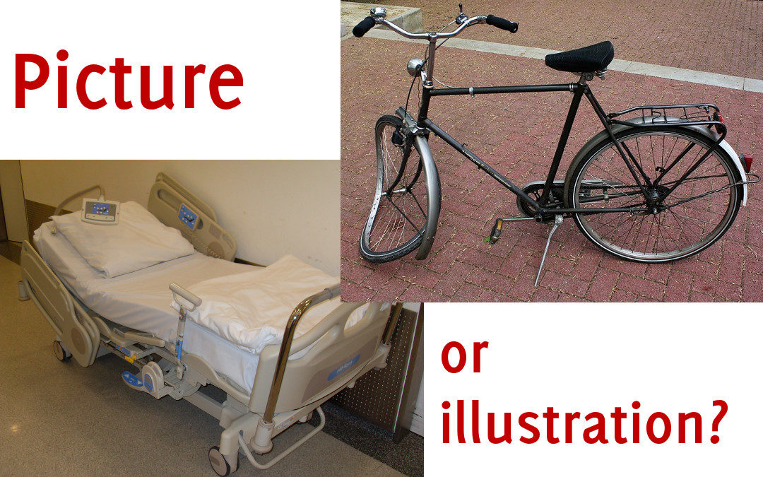
Also don’t underestimate the evocative power of images. Two of them side by side and a story is already created. Think of a bicycle with a hospital bed, they create a third image in the mind: the accident.
Graphics in type
Text can also be treated as a graphic element, starting from the font used. Look at the logo of elacandela as an example:

But there are other ways to combine graphics and type to convey messages or enrich existing ones. What is important is that there should be a conceptual coherence. Look at the difference between these two use cases.

In conclusion, the type of visual element you choose is important. Photographs are the most natural and the ones to which your audience will give more credibility. It is an instinct that we have wired and that is not mitigated by the knowledge that today even photographs are manipulable.
Icons and illustrations have their reason to be used in some cases and are not to be ditched.
Recent Comments