For many to start preparing a presentation means to turn on the computer and to launch a program like PowerPoint, Keynote or Impress to create the slides.
Actually, as I frequently joke in my workshops, no one nowadays creates slides, rather they apply the modern Lavoisiser Law: nothing is created, nothing is destroyed but everything is cut and pasted. So let’s assembly slide taken from other presentations adding some pictures taken from the web, maybe adapting all to the corporate template (where there is one).
This approach, albeit common, is not the optimal one to create a presentation that is going to be successful in moving an audience. Without an overall strategy, before designing the visual aids, it’s easy to put together many information without hitting the audience on a logical and emotional level. The result? Too many slides or too much text or too much data or all of them together.
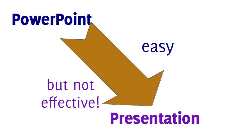
What we end up doing it’s this.

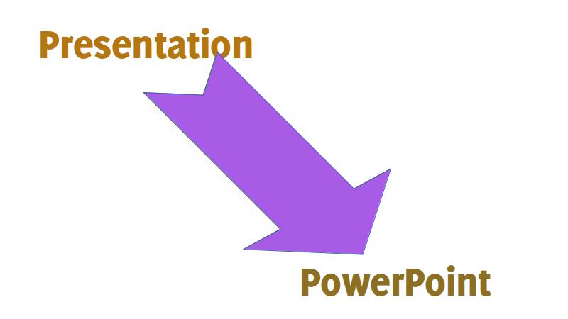
When what we should be doing it’s this instead.

We should approach slides, or any other visual aids, only after we decided exactly what we want to say and how we want to get it across.
Let’s reverse the process, start from the presentation. Which message do you want to get across? Which elements are you going to bring tu support your point? In which order are you going to present them? Which data or picture are you going to use to visualise these concepts?
This is how you should start preparing a presentation. Once you have the blueprint you can move on to the visual aids. I suggest you to sketch even your slides on paper, to have an overall view. Then it’s time to launch your presentation application and create your visual aids!
Cover picture by Leandro Verolli.


Recent Comments