
Say it with a flower! Or say it with a colour!
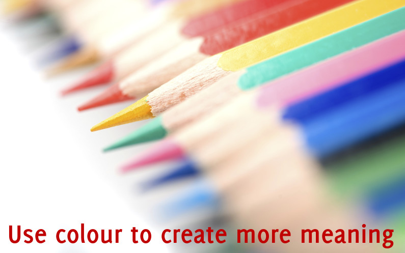
Colours communicate, we associate meanings to them, both consciously and unconsciously. For this reason you should use them accurately. Select them to enrich the emotional impact of your visual aids and help the audience comprehend the message you want to get across.
CALM
CALM
CALM
How does Calm changes in regard of its colour? Which hue is more coherent with the meaning of the word? Which one is stronger? Oddly the meaning is enhanced by a vibrant colour.
(this post has been inspired by the book Design Elements: A Graphic Style Manual)
Recent Comments