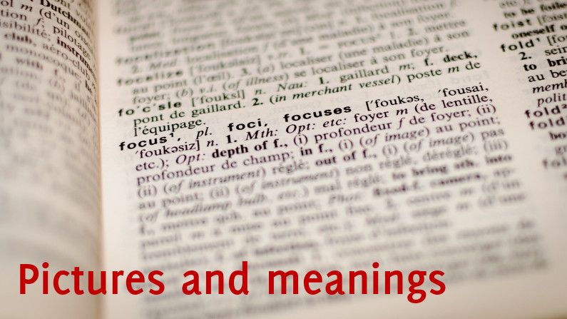
“A picture is worth thousand words” and surely it is.
In our presentations’ visual aids (slides typically) it’s advisable to limit text and use images in its place
Images can also help clarify the meaning of words, or define it better. I lift an example from a great graphic design book, let’s take the word lust. Now look at the following pictures:

It works even better when we watch the three pictures separately and each one with the word overlayed.


Three different images, each one could be the best one to convey the right meaning of the word.
Remember people don’t take meaning from your words, they assign a meaning to them. Help your audience to be on the same page as yours also by using your visual aids appropriately.


Recent Comments