
by Paolo | 28 April 2019 | Blog, LearnFromTED, Public speaking
A serie named #LearnFromTED cannot ignore the talk that has the highest ever number of views, currently over 57 millions, even more if we are talking about my absolute favourite TED presentation. Sir Ken Robinson is telling us how the education system has some flaws...
by Paolo | 27 April 2019 | Blog, Public speaking
It’s about the use of lights and darkness, something you can achieve in visual aids by playing with luminosity and hues. The contrast may help to deliver a concept, light and darkness add also an emotional layer that can engage more the audience. Try to take a...
by Paolo | 24 April 2019 | Blog, Public speaking
Contrast maybe in the distance that separates objects and shows how they are grouped. Bring them near or far to create rhythm and meaning most of all. Introduction and disclaimer are here
by Paolo | 22 April 2019 | Blog, Public speaking
Artists may be introspective and talk to themselves, communicators shouldn’t. Aim at a wide audience, let your message spread around and convey it so that it can be absorbed and appreciated also by people who don’t have your cultural background, your...
by Paolo | 31 March 2019 | Blog, Public speaking
Here is an easy one: readability. What is readable is your friend, and friend of your message. What is unreadable is an enemy and buries your message. Readability is about font family, size, colour, contrast (but also what is written, acronyms, buzzwords, …etc)...
by Paolo | 25 March 2019 | Blog, Public speaking
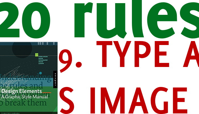
This seems a technical rule, and whilst it is, we can all apply it without too much hassle. Text is a set of lines, bends, dots and other elements. It has a colour, a thickness, a position, in other words it is a graphic as much as an image, a diagram or a photograph....


Recent Comments