
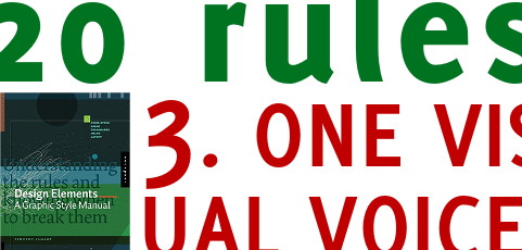
The key work here is ONE. Speak with one voice it means to have unity and continuity from a graphic point of view. If your titles are read, then all in red. If icons are there for an action, so be for all of them. Nicer and more elegant? Yes, but that is not the main reason. The purpose is support your audience message comprehension.
As soon as your public as understood your graphic language, and if it is required help them with guidance, then they will move faster inside your visual aids. Their energy and time will be dedicated to assimilate your concepts rather than squandered in figuring out how they are presented.
Recent Comments