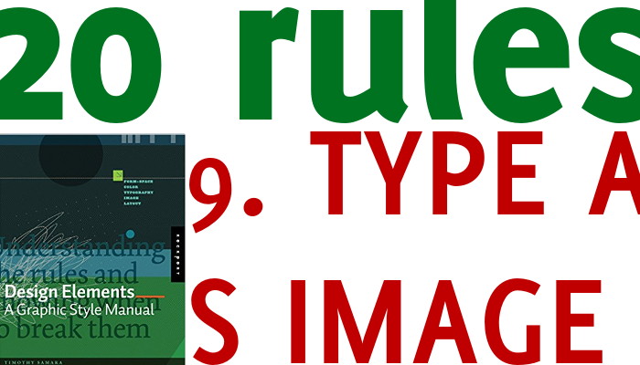
This seems a technical rule, and whilst it is, we can all apply it without too much hassle. Text is a set of lines, bends, dots and other elements. It has a colour, a thickness, a position, in other words it is a graphic as much as an image, a diagram or a photograph. As such is should be considered and integrated with other elements on your slide. If all my images are elegant and smooth with subtle colours, I want to avoid a rough font in bright colours (unless the contrast is what I exactly want).
You don’t need to become a graphical designer, most of the times you can tell at a glance if your text is coherent with the rest of your visual aids.


Recent Comments