
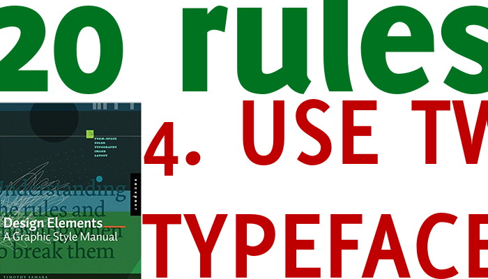
Likely a single font family, with different weights and styles, is more than enough in most cases. You may add a second one (keep in mind rule 3), but no more that that.
Too many typefaces are visual confusing and they don’t add any value, actually they are elements of distraction from the message.
Recent Comments