
Here is a rule I ignored in this post image, and without any valid motive I just could not do it better. The book cover, the series title, this post title… all smudged together, it’s not as it should be.
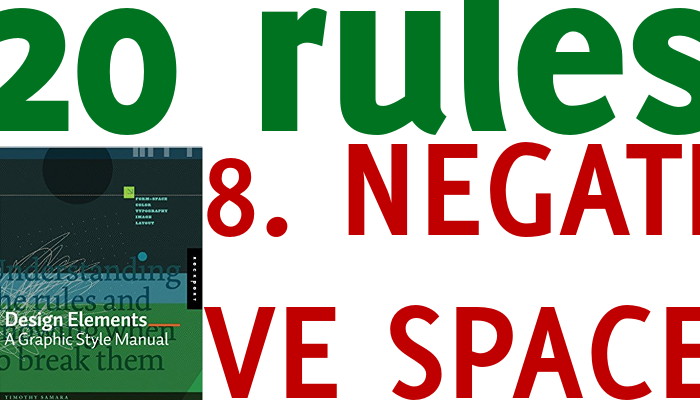
What is negative space? We could call it the background, the empty space… but it’s an empty that weighs as much as the full. If I put a tree in an empty room, the tree catches our attention. Take away the room and leave it in an empty space, and again the tree is the message. Move the tree in a wood, and it melts in the background. Same if you put in a busy city landscape. The tree maybe the only one, but what is the message? The tree or the building, or the lady crossing the road, or the red car parked….? The same is true for our visual aids
A slide (or a handout) is not a plot that you need to fill as much as you can, do you remember rule 7: less is more? Negative space, which could be white or any other colour, is the one that makes your content standout. Give it up and with it you are giving up your message too.
Recent Comments