by Paolo | 18 March 2019 | Blog, Public speaking
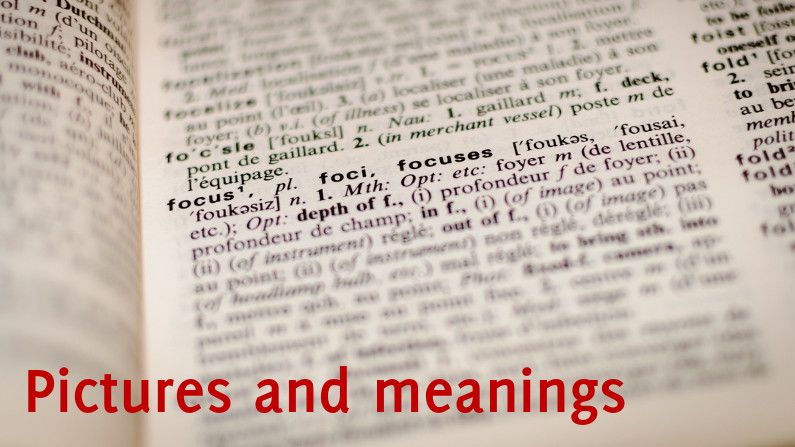
“A picture is worth thousand words” and surely it is. In our presentations’ visual aids (slides typically) it’s advisable to limit text and use images in its place Images can also help clarify the meaning of words, or define it better. I lift...
by Paolo | 17 March 2019 | Blog, Public speaking
Less is better in many cases. Or less is more. What should you do less? In pubic speaking there are many meanings you can give to it: less messages (only one main message), less words, less text, less decoration (unless it has a meaning). If we restrict ourselves to...

by Paolo | 8 March 2019 | Blog, Public speaking
Add colour (or color 😉 to you slides, but do it with discernment. Colours communicate and they add meaning as long as they are coherent. Would you suggest danger with azure or red? Bright or soft hues? Everything goes as long as there’s a good reason. A little...
by Paolo | 5 March 2019 | Blog, Public speaking
As soon as your slide is “up” your audience’s focus should be directed to one thing first. It could be the title, any other copy or an image. Use graphic design to make it clear where you want them immediately to look at! Introduction and disclaimer...
by Paolo | 27 February 2019 | Blog, Public speaking
Likely a single font family, with different weights and styles, is more than enough in most cases. You may add a second one (keep in mind rule 3), but no more that that. Too many typefaces are visual confusing and they don’t add any value, actually they are...

Recent Comments