by Paolo | 27 February 2019 | Blog, Public speaking
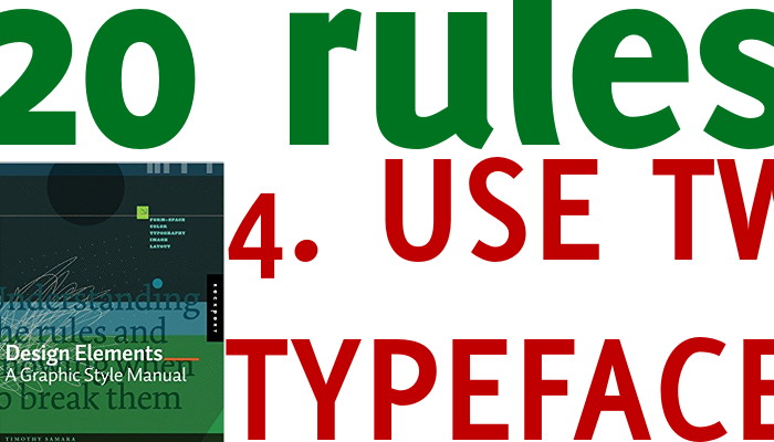
Likely a single font family, with different weights and styles, is more than enough in most cases. You may add a second one (keep in mind rule 3), but no more that that. Too many typefaces are visual confusing and they don’t add any value, actually they are...

by Paolo | 22 February 2019 | Blog, LearnFromTED, Public speaking
A new series on how to improve public speaking by watching TED presentations (#LearnFromTED), and how could I dedicate the opening to anything but Chris Anderson’s video? Before going straight to it I want to start by saying two important things. If you...
by Paolo | 16 February 2019 | Blog, Public speaking
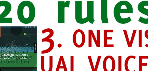
The key work here is ONE. Speak with one voice it means to have unity and continuity from a graphic point of view. If your titles are read, then all in red. If icons are there for an action, so be for all of them. Nicer and more elegant? Yes, but that is not the main...
by Paolo | 10 May 2018 | Blog, Public speaking
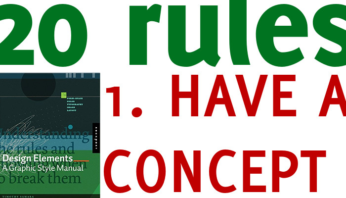
All 20 rules are important, the first one maybe even more! Albeit in the book the rule is more about the design here I use it to take a more general approach. When you communicate you must have something to say. A message, and idea or a concept you want to get across....
by Paolo | 3 February 2018 | Blog, Public speaking
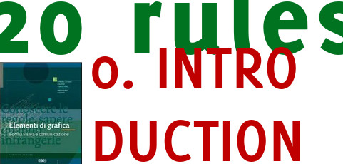
The idea came long ago from this Timothy Samara’s beautiful book: It talks about graphic design and it mentions 20 rules to keep in mind, you may break them, but only after you understood them and you do it for a good reason. Here they are: As you can see...

by Paolo | 20 January 2018 | Blog, Public speaking
How you format a number (when you present data, but not only) has a great impact on how it is perceived and evaluated even by professionals. A very interesting experiment is reported in the great book Thinking Fast and Slow by Daniel Kahneman at page 330....

Recent Comments